I posted last week about how AI tools have found their way into my workflows. For this update, I’ll just go into that a little more.
Let’s start with Saving Satoshi. I started using generative AI tools there when the project started in late 2022.
Here’s the first iteration of the cover image and the current one (which is expecting another revision). You can see how more detailed and crisp things have become.
The biggest change is the level of control that is now possible. Initially it was best to gave very short and vague instructions. Now we have much more precise control over camera angles, poses, etc. Here’s our initial rendering of the villain, and the current iteration. Insane progress.
A huge step forward are the image references I already mentioned in my last post. A year ago it was impossible to get consistent characters and I had to think about various tricks to hide that fact. For example, I had to be super picky with camera angles, and try to have only a single facial close-up throughout the whole experience, since I could not really recreate it. Now I can render a character in many poses with lots of expressions, and then feed those into the scenes I want to create. Still requires lots of tinkering, but it has opened up a ton of possibilities.
I have only sporadically dipped into video (generally and for this project). The first attempt was the teaser for Legends of Lightning Vol 2. The teaser is a series of 1-2 second clips with very quick cuts, simply because weird stuff started happening in all the clips. Hands merged into faces, helicopters morphed into different helicopters, etc.
Things are improving a lot. I have not tested much, except for those two clips below where I threw in images, quickly wrote some text, and let it render. But it’s clear that there is a lot more consistency already.
It’s going to be super interesting to see how this evolves over the next months and years. Will we have a Saving Satoshi movie rivaling Avatar at some point?
Either way, it’s amazing to be able to tell the story of the project so visually and I hope it creates a uniquely interesting learning experience.
Now, let’s look at the initiative around creating a site about open design, similar to opensource.guide, to serve as an entry point and learning tool for new designers into the open-source arena. It’s summer and things are a bit slow right now, so I thought to myself why not see if AI can generate a foundation for the content. Claude really delivered here. Within a couple of days, I was able to put together opendesign.guide, using generated content and illustrations (and my favorite web framework Nuxt).
It’s always good to keep in mind that AI is a bullshitter, in the Harry Frankfurt sense.
bullshit is speech intended to persuade without regard for truth. The liar cares about the truth and attempts to hide it; the bullshitter doesn't care whether what they say is true or false.
It’s pretty convincing, but that doesn’t mean it knows what it’s talking about. The ultimate authority still has to be us. But still, this allows us to outsource a lot of groundwork, prototype and iterate quickly, and we can focus our time more on being creative directors and content directors. Things become much more easily moldable.
AI also helped code the site, via Github Copilot in VS Code. You can chat with Copilot and ask it questions about your code (is it accessible? did I miss catching any errors?). It also super powers auto-complete. Instead of it completing your variable name, you get whole functions. And it works incredibly well.
I totally feel like I got some huge power-ups with all these goodies. And the applications got a lot further (like my test in January, where I downloaded Telegram group content and had AI summarize it problems users talked about).
I have not seen any good solutions for UI design yet, which is a bit curious. Figma introduced a tool recently that basically just creates an initial template for you. But I imagine the real power lies in AI being a companion throughout the process. It should be able to auto-complete screens based on your design system. Or build a design system from some designs you’ve done. And revise the copywriting for clarity and consistency, and remove technical jargon. And automatically merge in contributions from other designers. There’s a ton of manual work that could be simplified. And if that happens, our output and quality of work should increase a lot, which should be reflected in much better user experiences.
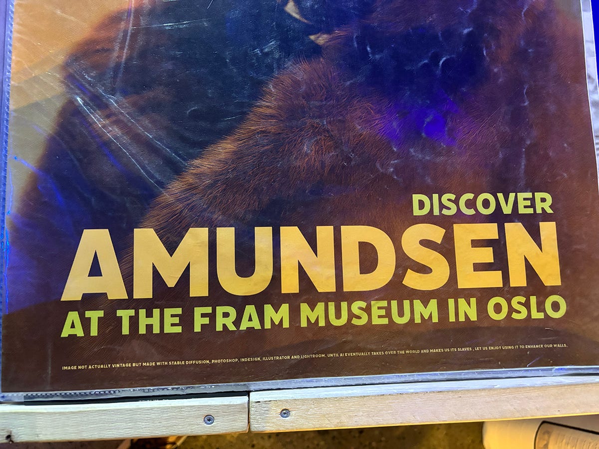
I’ll wrap up with this above photo of a poster from the Fram Museum shop in Oslo. In the fine print, it says that the photo was AI generated (and then manually edited) and states:
Until AI eventually takes over the world and makes us its slaves, let us enjoy using it to enhance our walls.
😀
I’m also listening to the audio version of The Singularity is Nearer right now, which goes into the history, current state, and potential future of AI. Also very interesting.
✌️


